Key Takeaways: The 2026 color story is about feeling, not just hue. We’re moving away from stark whites and cool grays toward warmer, more complex neutrals. Texture and finish are now as important as the color itself. And the biggest shift? A confident embrace of personalized, mood-driven palettes over prescribed trends.
So, you’re thinking about paint. Maybe you’re staring at a sea of swatches, feeling that familiar paralysis. I get it. We’ve been in hundreds of San Diego homes, from the breezy beach cottages of Ocean Beach to the mid-century gems in Clairemont, and the number one question is still, “What color should I choose?”
The answer for 2026 isn’t a single shade. It’s a philosophy. We’re finally done with the era of the “perfect” neutral that made every room feel like a sterile showroom. Clients are tired of spaces that look good in a catalog but feel impersonal in real life. The new goal is a palette that feels authentic, layered, and, above all, livable.
What’s Driving the 2026 Color Shift?
It’s a reaction, honestly. After years of global uncertainty, people want their homes to be a sanctuary—not just visually calm, but emotionally warm. That cool, gray greige that dominated the 2010s? It often felt detached, especially in our Southern California light, which can render it flat and blue. Now, we’re seeing a pull toward colors with a heartbeat: neutrals with subtle red or yellow undertones, greens that connect us to nature, and blues that soothe rather than chill.
It’s also a practical move toward longevity. People are investing in their homes and want choices that will feel relevant for more than a season. That means favoring timeless, complex colors over fleeting fads.
The 2026 Palette: A Breakdown of the Moods
Forget “color of the year.” Think in terms of emotional landscapes. Here’s what we’re actually specifying and why.
Earthed Neutrals: The New Baseline
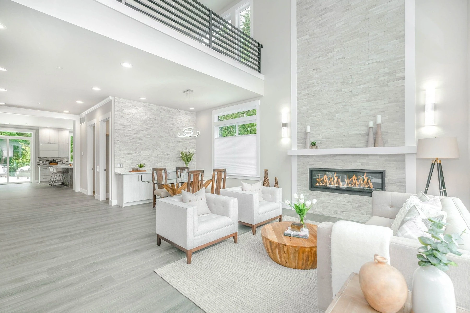
This is where the big change is most evident. We’re replacing cold grays and bright whites with warmer, dirtier, more organic neutrals. Think of the color of unbleached linen, warm stone, or sun-baked clay.
- Why it works: These colors are inherently welcoming. They provide a neutral backdrop but have enough depth to feel interesting. They play beautifully with natural materials like oak, rattan, and leather, which are huge right now. In a San Diego room flooded with light, a warm white like “Swiss Coffee” or a soft clay tone creates a glow, whereas a pure white can feel glaring.
- The trade-off: Because they have undertones (often pink, yellow, or green), they can shift dramatically in different lights. A color that looks like a soft beige in your north-facing living room might pull peachy in your south-facing kitchen under the afternoon sun. This is the number one mistake we see: not testing large swatches at different times of day.
Quiet Drama: The Return of Depth
We’re seeing a bold move away from all-over light colors. Feature walls are back, but smarter. It’s about using deeper, moodier shades to create intimacy and definition. Rich, matte charcoal in a study; a deep, inky blue in a dining room; a forest green in a library nook.
- The practical consideration: Dark colors require a commitment to good lighting design. They absorb light, so you’ll need layered lighting—sconces, lamps, maybe even picture lights. But when done right, the effect is incredibly cozy and sophisticated. It’s a fantastic trick for awkward spaces or rooms with less-than-perfect architectural details, as the dark color recedes and hides flaws.
Biophilic Hues: Greens & Organic Blues
This isn’t “sage green” as an accent. It’s a full spectrum, from pale, misty celadon to deep, saturated moss. Blues are following suit—less nautical, more like a hazy sky or a deep lake. These colors directly support the biophilic design principle, which links human well-being to connection with nature.
- Real-world application: In coastal areas like La Jolla or Point Loma, these colors feel like a natural extension of the environment. But the key is saturation. We’re avoiding neon or overly bright tones. The goal is a muted, restful version that feels integrated, not themed.
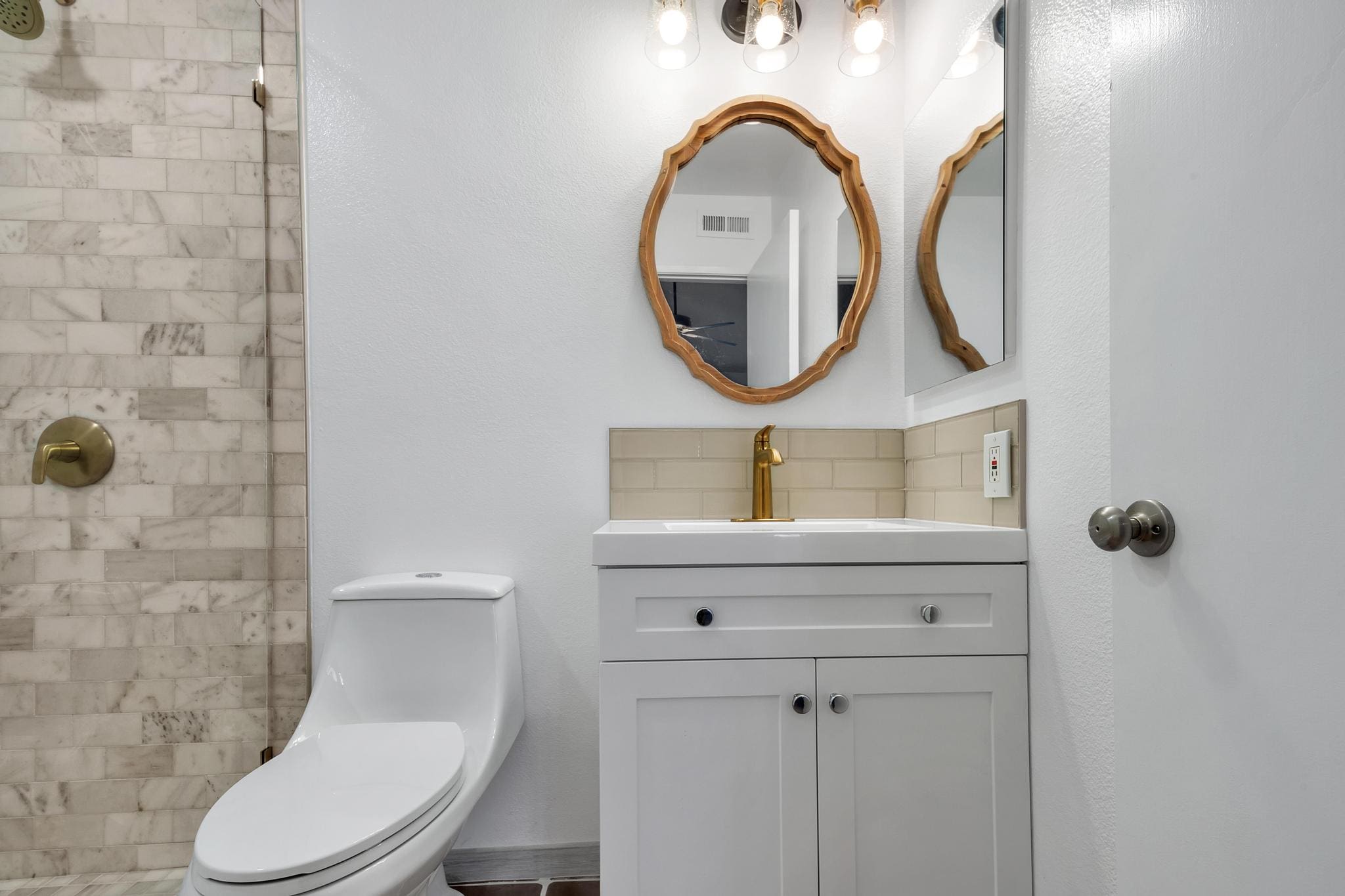
The Finish is the Final Word
In 2026, the sheen is doing as much work as the color. The trend is decisively toward low-luster, tactile finishes.
- Matte & Flat: The undisputed champion for walls. It hides imperfections better than eggshell, provides a velvety, contemporary look, and avoids the reflective glare of higher sheens. The downside? It’s less washable. In a kid’s hallway or kitchen, you might need a durable matte or a satin for practicality.
- Limewash & Plaster Effects: We’re specifying these more for their visual texture than their historical authenticity. They create a beautiful, variable depth that plain paint can’t match, adding a layer of artisan craft to the walls. It’s an investment, but for a focal wall, it’s unparalleled.
When to Call a Professional (A Real-World Aside)
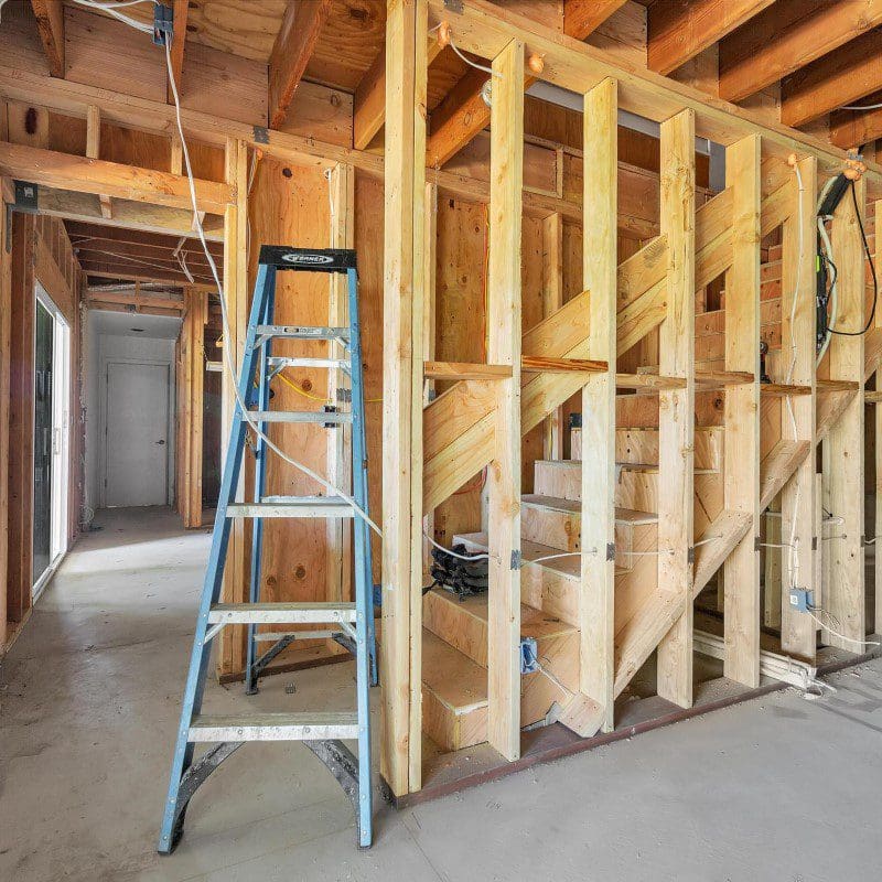
Look, I’m a huge advocate for DIY where it makes sense. Painting a small room? Go for it. But when the palette involves multiple rooms, complex lighting, or architectural features, the value of a design professional isn’t just in picking colors—it’s in creating a cohesive system.
We recently worked on a Spanish-style home in South Park where the client had painted each room a beautiful but disconnected color. The house felt chaotic. Our job was to create a flowing palette that respected the architecture and light flow from the front courtyard to the back patio. That’s systems thinking. It saves you from the costly mistake of repainting twice and the headache of a home that doesn’t feel unified.
Your 2026 Color Strategy: A Practical Table
Here’s a straightforward way to think about applying these trends based on your goals.
| Your Primary Goal | Recommended Color Family | Key Consideration & Finish | A Potential Pitfall to Avoid |
|---|---|---|---|
| Make a room feel larger, brighter, and airy | Earthed Neutrals (warm whites, soft clays) | Use a matte finish to reduce glare. Ensure ample artificial light for evenings. | Choosing a white that’s too cool, which can feel sterile and clinical in warm light. |
| Create a cozy, intimate, or dramatic mood | Quiet Drama (deep charcoals, navies, greens) | Commit to layered lighting (overhead + task + accent). Matte finish is essential. | Painting a dark color in a room with poor natural light; it can feel like a cave without proper fixtures. |
| Connect the indoors with outdoor views | Biophilic Hues (muted greens, organic blues) | Pull inspiration from your specific landscape. A dusty sage works inland; a hazy blue-gray suits coastal. | Going too literal or saturated (e.g., “golf course green” or “pool blue”). Mute it down for sophistication. |
| Add character to a bland builder-grade space | A mix of the above. Use earth neutrals on main walls, a biophilic hue on built-ins, and drama on the ceiling. | Use the “60-30-10” rule as a starting guide for balance. | Using too many strong colors in one small space. Let one element be the star. |
The Bottom Line: It’s About Feeling, Not Following
The most exciting trend for 2026 is the permission to personalize. The “rules” are relaxing. We’re painting ceilings in bold colors, using different (but related) colors in open floor plans to define zones, and prioritizing the emotional weight of a color over its popularity.
Start with how you want the space to feel. Then, work backward to find colors that evoke that mood. Test them in large swatches. Observe them at dawn, noon, and with your lights on at night. Your home isn’t a magazine shoot; it’s the backdrop to your life. Choose colors that make you feel grounded, comforted, and inspired to live in it. And if you get lost in the process, sometimes a conversation with a local pro like us at Golden Shore Design & Build can provide the clarity you need to move forward with confidence.
Related Articles
People Also Ask
The most influential color palettes for 2026 interior design are moving toward grounded, sensory-rich hues. Expect to see a strong shift toward earthy neutrals like warm clay, deep taupe, and mushroom gray, which create a calming, organic foundation. These are paired with moody, saturated accents such as aubergine, forest green, and oxidized rust to add depth without overwhelming a space. Another key trend is the rise of soft pastels with a mineral finish, like dusty lavender and sage, offering a modern alternative to stark whites. For a bolder statement, consider deep navy or charcoal as a primary wall color, balanced by lighter textiles and natural wood. At Golden Shore Design and Build, we recommend testing these palettes with your existing lighting to ensure the tones feel cohesive and inviting throughout your home.
The color palettes shaping 2026 kitchen interior design move away from stark whites toward warmer, more organic tones. Deep earthy hues like terracotta, sage green, and rich clay are popular for cabinetry, creating a grounded, inviting atmosphere. Soft, muted neutrals such as warm oatmeal and greige are replacing cool grays for walls and backsplashes. For a touch of sophistication, deep navy and charcoal are emerging as accent colors for islands or lower cabinets. These palettes are often paired with natural wood tones and matte black or brushed brass hardware. Golden Shore Design and Build can help you integrate these trending colors into a cohesive kitchen design that feels both current and timeless for your San Diego home.
For 2026, interior paint trends are shifting toward warm, earthy neutrals and nature-inspired hues. Expect to see soft terracottas, muted sage greens, and warm greiges replacing cooler grays. Deep navy and charcoal remain popular for accent walls, while creamy whites and light beiges offer timeless backdrops. These colors create a calming, grounded atmosphere that complements natural materials like wood and stone. When selecting your palette, consider how natural light affects each shade throughout the day. For professional guidance on choosing and applying these trending colors, Golden Shore Design and Build can help you achieve a cohesive look that suits your San Diego area home.
For exterior house paint colors in 2026, the trend is moving toward earthy, organic tones that blend with the natural landscape. Warm greiges, soft sage greens, and deep terracotta are popular choices, as they create a welcoming and timeless look. Darker accents, such as charcoal or navy, are often used on trim and shutters to add contrast and depth. It is also wise to consider your home's architectural style and the surrounding environment when selecting a palette. If you are planning a repaint, a professional consultation can help you choose colors that will enhance curb appeal and last for years. Golden Shore Design and Build recommends testing samples on your exterior walls before making a final decision, as lighting can significantly affect how a color appears.
Based on current trend forecasts, the fashion color for 2026 is expected to be a deep, calming shade known as "Future Dusk." This color is a blend of deep blue, violet, and a hint of gray, representing a shift toward mindfulness and digital optimism. It is a versatile hue that works well in both interior design and fashion, offering a sophisticated alternative to traditional neutrals. For homeowners in San Diego, Chula Vista, and National City, incorporating this color into accent walls or cabinetry can create a serene yet modern atmosphere. Golden Shore Design and Build recommends using Future Dusk in smaller doses, such as on a feature wall or in soft furnishings, to add depth without overwhelming a space.