We’ve all been there. You walk into a room and something just feels off. The furniture is nice, the layout works, but the walls are flat. Lifeless. That’s usually when the idea of a statement wall comes up. But here’s the thing most people get wrong: they treat it like a decoration, not a design decision. A statement wall isn’t just about picking a bold color or slapping up some wallpaper. It’s about understanding how light moves through a room, how materials age, and how your daily life actually interacts with that surface.
Key Takeaways:
- A statement wall works best when it responds to the room’s natural light and function, not just your favorite color.
- Texture and material choice matter more than pattern or paint in high-traffic areas.
- Common mistakes include choosing the wrong wall, ignoring scale, and overlooking maintenance realities.
- In coastal climates like San Diego, moisture and sun exposure should drive material selection.
Table of Contents
Why Most Statement Walls Fail Within a Year
We’ve seen this pattern play out more times than we can count. Someone gets inspired by a Pinterest board, picks a dark navy accent wall, and six months later they’re asking us how to repaint without ruining the rest of the room. The problem isn’t the color itself. It’s that the wall they chose faces west, gets hammered by afternoon sun, and now the paint is fading unevenly. Or they picked a textured wallpaper in a bathroom that doesn’t have a proper exhaust fan, and now there’s peeling at the seams.
The real issue is that people treat statement walls as an afterthought. They pick a wall because it’s the first one they see when they walk in. That’s rarely the right choice. The wall that actually needs the statement is the one that frames a view, anchors a seating area, or creates a natural transition between spaces. If you’re picking the wall opposite the door just because it’s big, you’re probably going to regret it.
The Wall You Choose Matters More Than the Material
The focal point rule
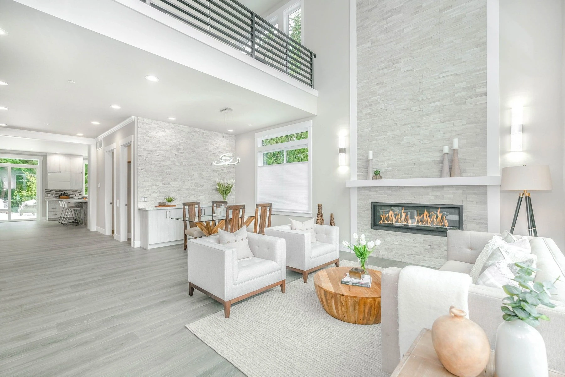
There’s a simple test we use on every project. Stand in the doorway of the room and look straight ahead. What’s the first thing your eye lands on? If it’s a window, that’s your focal point. If it’s a fireplace, that’s your focal point. If it’s a blank wall, that’s your opportunity. But here’s the catch: your statement wall should support the focal point, not compete with it.
We worked on a home in the Mission Hills neighborhood a few years back where the living room had this gorgeous bay window overlooking Balboa Park. The homeowner wanted to do a dark green accent wall on the wall opposite the window. That would have created a tunnel effect, drawing the eye away from the natural light. Instead, we convinced them to do a subtle limewash treatment on the wall adjacent to the window. It caught the light differently throughout the day and actually made the window feel bigger.
Traffic and touch points
Another reality check: how often do people actually touch that wall? In a hallway, a statement wall near a light switch or door handle is going to show wear fast. In a dining room, the wall behind the table is going to get scuffed by chairs. In a kid’s playroom, forget about it unless you’re using something that can be wiped down.
We’ve started recommending magnetic paint or chalkboard paint in homes with young children, but only on walls that are already going to get beat up. It turns a maintenance problem into a feature. If you’re in a rental or a condo where you can’t paint, peel-and-stick wallpaper has come a long way, but it still doesn’t hold up in humid spaces.
Material Matters: Paint, Wallpaper, Wood, or Stone?
This is where most people get overwhelmed, and honestly, there’s no single right answer. It depends on your climate, your budget, and how much abuse that wall is going to take. Let’s break it down honestly.
| Material | Best For | Watch Out For | Lifespan | Cost Range (per sq ft) |
|---|---|---|---|---|
| Paint (high-gloss or matte) | Low-traffic bedrooms, accent behind headboard | Fading in direct sun, touch-up color matching | 2–5 years before repaint needed | $1–$4 |
| Wallpaper (traditional or peel-and-stick) | Rental-friendly updates, powder rooms | Seam peeling in humidity, difficult removal | 3–7 years with proper prep | $3–$15 |
| Wood paneling (shiplap, reclaimed, or slat) | Living rooms, home offices, feature walls | Expansion/contraction in coastal climates, dust collection in slats | 10–20 years with proper sealing | $8–$25 |
| Stone veneer or brick | Fireplace surrounds, exterior-adjacent walls | Moisture wicking, weight load on drywall | 20+ years | $15–$40 |
| Textured finishes (limewash, Venetian plaster) | Warm, aged look in living areas | Requires skilled application, hard to patch | 10–15 years | $10–$30 |
The honest truth: we’ve ripped out more wallpaper than we’ve installed in San Diego homes. The coastal humidity here is no joke. Even with proper primer, wallpaper in a bathroom or kitchen that doesn’t have serious ventilation will fail within two years. If you love the look of pattern, consider a tile statement wall instead. Porcelain tile that mimics wallpaper patterns is becoming more common, and it handles moisture like a champ.
The Scale Trap: Bigger Isn’t Always Better
One of the most common mistakes we see is people trying to make a statement wall cover an entire room. That’s not a statement wall, that’s just a paint job. A statement wall should feel intentional, not accidental. It should stop before the ceiling sometimes. It should wrap around a corner or end at a natural break point.
In a recent project in North Park, the homeowner wanted to do a floor-to-ceiling slat wall in their home office. The room was only 10 by 12 feet. A full slat wall would have made the space feel like a sauna. Instead, we did a partial wall treatment that started three feet from the floor and stopped a foot from the ceiling, with a floating shelf at the transition line. It created depth without overwhelming the room.
Scale also applies to pattern. If you’re using wallpaper with a large-scale floral or geometric print, it’s going to dominate a small wall. Save those for walls that are at least eight feet wide. Small patterns or textures work better in narrow spaces like hallways.
Lighting Changes Everything
This is the part that almost nobody thinks about until it’s too late. A statement wall in a room with overhead lighting only is going to look flat at night. The texture or color you fell in love with in the showroom under perfect lighting will look completely different under a warm LED bulb at 7 PM.
We always recommend adding dedicated lighting to a statement wall. A picture light, a track light, or even a simple floor lamp aimed at the wall can transform how the material reads. If you’re doing a wood slat wall, consider backlighting it with an LED strip behind the slats. It creates a glow that changes the whole mood of the room.
In San Diego, where we get a lot of natural light, we also have to think about UV exposure. Direct sunlight will fade paint and wallpaper unevenly. If your statement wall gets direct sun for more than two hours a day, consider using UV-resistant paint or choosing a material like wood or stone that doesn’t fade.
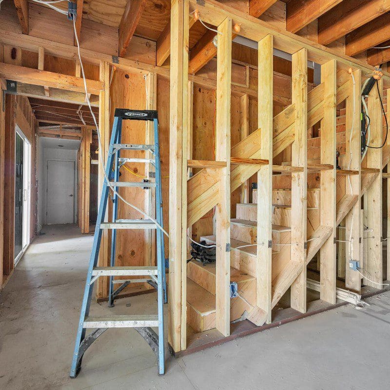
When Professional Help Actually Saves You Money
We get a lot of calls from people who tried to DIY a statement wall and ended up with a mess. The most common one is wallpaper that was hung wrong, with visible seams or bubbles. That’s not a cheap fix. You either live with it or pay someone to strip it and start over.
Another scenario: someone bought expensive reclaimed wood panels and tried to install them without acclimating the wood to the room’s humidity. Three months later, the panels cupped and gaps appeared. Wood needs to sit in the room for at least 48 hours before installation, especially in coastal climates.
If you’re doing anything beyond paint, it’s worth at least getting a consultation from a professional. Accent walls that involve structural changes, like adding stone veneer or built-in shelving, require proper framing and moisture barriers. Skipping those steps can lead to mold or structural damage that costs thousands to fix.
At Golden Shore Design & Build in San Diego, we’ve seen both sides of this. The homeowner who spent $200 on materials and three weekends of frustration, and the one who spent $800 on professional installation and had it done in two days with a warranty. The second one is almost always happier.
Alternatives That Work Better in Some Spaces
Sometimes a statement wall isn’t the right move at all. If you’re in a small apartment with low ceilings, a bold wall can make the space feel even smaller. In that case, consider a statement ceiling instead. Painting the ceiling a darker color or adding a subtle pattern draws the eye up and makes the room feel taller.
Another alternative is a gallery wall. It gives you the visual impact without committing to a permanent change. You can swap out art as your taste evolves, and it doesn’t require any prep work on the wall itself.
For renters, we’ve started recommending temporary wall panels made from lightweight materials like PVC or foam board. They attach with adhesive strips and come down without damage. They’re not as durable as real wood, but they give you the look without the commitment.
The Maintenance Reality Nobody Talks About
Let’s be real for a second. A statement wall is going to require more upkeep than a standard painted wall. Textured surfaces collect dust. Wood slats need to be dusted or vacuumed regularly. Stone veneer can trap moisture behind it if not installed with a proper vapor barrier.
If you’re not willing to clean that wall more than once a month, stick with paint. A high-gloss paint is surprisingly easy to wipe down and still makes a statement. Matte finishes look great but show every fingerprint and scuff.
We’ve also learned the hard way that some materials don’t mix well with San Diego’s specific conditions. We’re in a Mediterranean climate with dry summers and mild, wet winters. That fluctuation causes materials to expand and contract more than in a climate-controlled interior. If you’re using real wood, it needs to be sealed on all six sides, including the back, or it will warp.
When to Walk Away From the Idea
Not every room needs a statement wall. If you have a room with multiple windows, doors, or architectural features, adding a statement wall can make it feel cluttered. Sometimes the best statement is no statement at all. Let the architecture speak for itself.
We’ve also seen people try to force a statement wall in a room that already has a strong visual element, like a brick fireplace or exposed ductwork. That’s just visual noise. Pick one hero element and let everything else support it.
If you’re on a tight budget and can’t afford quality materials, wait. A cheap statement wall looks exactly like what it is. Save up for something that will last, or do a high-quality paint job with a bold color and call it a day.
The Ground Truth
A statement wall is a commitment. It’s not a weekend project that you can undo easily. It changes how a room feels, how light behaves, and how you interact with the space. The best ones we’ve seen are the ones that feel like they were always part of the room, not something that was added later.
If you’re in San Diego and thinking about making a change, pay attention to how the light moves through your home throughout the day. Walk the room at different times. Touch the walls. Think about how you actually live in that space, not how you want it to look in a photo.
And if you’re unsure, get a second opinion. Sometimes the best advice is just someone telling you that your idea needs a small adjustment. That’s the difference between a wall that works and a wall you learn to ignore.
Related Articles
Reimagine Your Living Room With 2026 Design Trends
Color Palettes Inspired By San Diego’s Natural Beauty
How To Blend Vintage And Modern Styles Seamlessly
People Also Ask
Choosing the right statement wall for your space requires balancing bold design with practical execution. Start by selecting a wall that naturally draws the eye, such as one behind a sofa, bed, or fireplace. Avoid walls with windows or doors, as they can interrupt the visual flow. For a DIY approach, consider peel-and-stick wallpaper, a bold paint color, or a textured finish like shiplap or board-and-batten. Always prepare the surface by cleaning and priming it to ensure proper adhesion. For a more curated look, you can create a gallery wall using frames of varying sizes. If you are considering a major update, Golden Shore Design and Build recommends reading our internal article titled Reimagine Your Living Room With 2026 Design Trends for professional insights on modernizing your space. Measure carefully and test samples before committing to ensure the final result enhances your room's natural light and layout.
For a bedroom accent wall, the best choice is typically the wall that your bed is centered against. This wall naturally draws the eye and creates a strong focal point, anchoring the entire room. If your bed is not centered, choose the wall that first catches your attention when you enter the room, such as the one opposite the door. Avoid accenting a wall with windows or doors, as this can break the visual flow. A solid wall without interruptions allows the accent color or texture to shine. At Golden Shore Design and Build, we recommend considering the room's natural light; a wall that receives good sunlight can enhance a bold color, while a darker wall can add coziness. Always test paint samples on the wall first to see how the shade changes throughout the day.
Choosing an accent wall color starts with understanding the room's purpose and existing palette. For a cohesive look, select a shade that is three to four times darker or lighter than your main wall color, or pull a hue directly from a prominent pattern in the room, like a rug or artwork. Consider the lighting; north-facing rooms benefit from warm tones like terracotta, while south-facing spaces can handle cooler blues or deep greens. For San Diego homes, we often recommend drawing inspiration from local landscapes. For more specific guidance on this topic, you can read our internal article Color Palettes Inspired By San Diego’s Natural Beauty. Golden Shore Design and Build always advises testing large paint swatches on the wall to see how the color shifts throughout the day before committing.
To choose an accent wall for wallpaper, start by selecting the wall that naturally draws the eye, such as the one behind a bed, sofa, or fireplace. Avoid walls with many windows or doors, as these can disrupt the pattern. Consider the room's purpose; a bold pattern works well in a living room or dining area, while a subtle texture is better for a bedroom. The accent wall should complement the existing color palette and furniture, not clash with it. A large-scale print can make a small room feel bigger, while a dark pattern adds coziness to a spacious area. For professional guidance on installation and design, Golden Shore Design and Build can help you select and apply the perfect wallpaper for your San Diego home.
In a bathroom, the ideal wall for an accent feature is typically the one that serves as a natural focal point. This is often the wall behind the vanity or mirror, as it draws the eye upon entry and frames the primary functional area. Alternatively, the wall opposite the door can create a strong visual anchor. For a cohesive look, choose a wall that is not interrupted by windows or large fixtures. When planning your design, consider how materials like tile or bold paint will interact with lighting. For expert guidance on mixing styles, our internal article How To Blend Vintage And Modern Styles Seamlessly offers valuable insights. At Golden Shore Design and Build, we recommend selecting a wall that balances the room's proportions without overwhelming the space.